Applies To: □ PoliteMail Desktop ■ PoliteMail Online □ PoliteMail O365
Version: □ 4.9 □ 5.0 ■ 5.1+
Introducing the new PoliteMail Builder!
What's New?
- More visual layout for easier use
- Adding content items has been moved under the Build a Template section.
- Social media icons have moved to be a standalone content item instead of being under the Footer Template Section.
- Spacers have been added as content items you can add to a Template.
- Save a click! Access your saved Templates directly from the Builder pane.
- Ai/B testing can be accessed directly from the Builder pane.
- Folders! Folders are a new way to organize your content, even entire layouts, and share them with others.
How to Try it Out

 PoliteMail now has a toggle to try out new features! Click on your avatar in the top right corner of the screen, then click the toggle to try the new Builder.
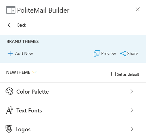
The new PoliteMail Builder has four parts: Brand, Build a Template, Saved Templates, and Folders. Each is described in greater detail below.
Brand
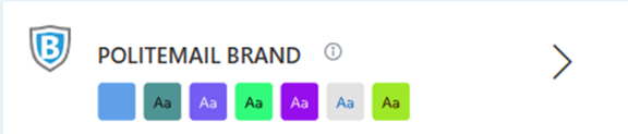
- The Brand card displays the colors currently used in the active Brand Theme.
 To view the name of the currently used Theme, hover your mouse over the information icon (i).
 - To create a new Brand Theme or edit an existing Brand Theme, click the > (This is the same as selecting 'Brand Themes' from the ≡ button in the previous Builder).
- To use a different existing Brand Theme, click the ˅ next to the current Theme name and select from the list.
- When modifying the current Brand Theme or creating a new one, you have three areas you can edit: Color Palette, Text Fonts, and Logos.
 To view the name of the currently used Theme, hover your mouse over the information icon (i).
 Color Palette
 The Color Palette section allows you to set the default colors used in your Theme, as well as the font characteristics for each Template Section, such as the Body or Header row.
- The Color Swatches show all colors currently available for use in the Theme. Click on any color square to change that color. To remove a color, click on the ‘x’ that appears when you hover over it with your cursor.
- Note that just like the previous Builder, Brand Themes that you share cannot be changed by other users.
- Click on the square to the left of each Template Section to change the color. You can select any available color from among the swatches.
- Click on the + button to change the font, font size, font color, and whether it should be bold or italics.
Text Fonts
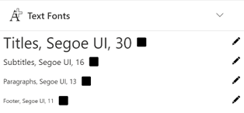 The Text Fonts section lets you quickly select a different text type for the Title, Subtitle, Paragraph, and/or Footer.
To define the look of other components, use the Color Palette section above and click the color square next to the component.
Logos
 The Logos section is used to upload any standard logo to be used in the Theme. You can add up to four different logos, one each for the header or footer, and for both a light as well as a dark background.
Once you're all set, you can click the 'Save Brand Theme' button to save your progress and click the 'Compose with Theme' button to create a message with the current Theme.
Build a Template
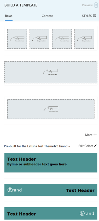 This section contains most of the options from the hamburger menu ≡ in the previous Builder. There are three tabs in this section: Rows, Content, and Styles.
Rows
The Rows tab allows you to select a header, body, and footer for your message. You can choose from generic/blank options, options based on your current Brand Theme, or even legacy items from the previous Builder if you’re used to those.
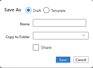
Double-click on any item to insert it into your message. You have a Save As button to save it at any time. Completed and ready to use Templates can be saved as a Template, whereas you can save any work in progress as a Draft.
 Finally, you can also save your work as a Page. This is optional but gives you another way to organize your work. As an example, a Page might be finished content that is not quite up to the level of a full Template, but it’s up to you how, or if, to use it.
You can also use the ‘Build it for me’ button to take advantage of PageWorthy, a professional email design service made specifically to be used in PoliteMail.
Content
 Use the Content tab to access and use any saved content in PoliteMail that you own or has been shared with you. This is the same as clicking on the hamburger button ≡ and selecting a content item in the previous Builder.
You can access and add saved Images, Buttons, Smart Attachments, Links, and Paragraphs from here, as well as add a Text style (as defined in Text Styles section in Text Fonts above) or a choice of various social media icons or spacers.
Add any content item by double-clicking it, or by dragging it onto your message.
Styles
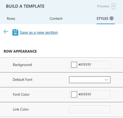 Clicking on the ‘Styles’ tab allows you to change the formatting of any row of your Template. Just click on the row you want to change, and you will have the option to change the background color, font, font color, or link color.
Once you’ve made your changes, you can save the row as a new Template Section.
Saved Templates
 The Saved Templates panel lets you quickly access your most recently viewed Templates. Just drag the Template you wish to use over to the email window, and the Template is applied for you.
By default, the five most recent Templates are displayed, but you can view all Templates by clicking the > on the right side. Click the > as well if you want to search for, share, or tag a Template, or copy it to a Folder.
Finally, items in the Saved Templates pane are broken down into Templates, Drafts, and Pages. You can save as any of these three types when clicking 'Save As' while creating your content in the 'Build A Template' pane.
Folders
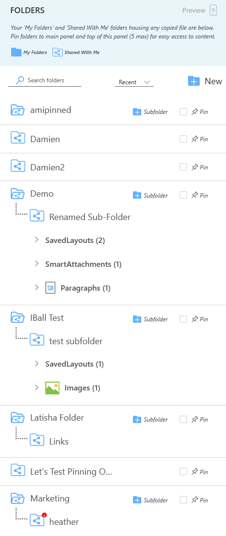 New to the PoliteMail Builder is Folders! Folders are a great way to organize all your content items that make up your Templates. Folders can hold any content items, such as Links, Smart Attachments, Images, and more, as well as saved layouts. You can even create Subfolders under a Folder, although you cannot make a subfolder in a subfolder.
The Folders pane will show any Folders that you have pinned for quick access. Clicking on the > will display all folders and additional options, or you can click on the specific pinned folder to view it in detail.
Creating a Folder or Subfolder
To create a new Folder, click on the 'New' button from the Folder list.
 To create a new Subfolder, click on the parent Folder and then click the '+ Subfolder' button.
Adding Items to a Folder

 To add an item to a Folder, select the layout or content item from the Template or Content list that you wish to add, and click the 'Save As' button.
You'll see the 'Copy to Folder' drop down menu, where you can select the Folder you want and click 'Save'.
Pinning a Folder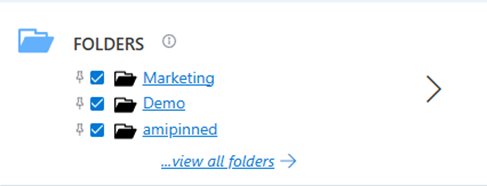

 When viewing a Folder, click the 'Pin' button to the right for the folder to display in the main Builder pane to easily access it.
Sharing a Folder
To share any Folder, click the … next to the Folder name when you hover over it with your mouse, and click on ‘Share’. You can also click on it to rename or delete the Folder or Subfolder.
- Note that sharing a Folder will also share all Subfolders under it.
Sharing Folders Containing Content that is Not Shared
If you have any items, such as Images or Smart Attachments, that are not marked as Shared individually WILL be accessible to other users if the item is in a Folder that is marked as Shared. Note, however, that the individual item is not accessible from the Content pane; the items will only be accessible via the shared Folder.
